This resource covers some of the on-chain metrics that our content and research team routinely use when assessing a certain cryptocurrency or the broader crypto market.
Introduction
With public blockchains such as Bitcoin and Etheruem, transactions are publicly recorded on-chain. Over the years, dozens of on-chain metrics and analytical tools have been developed in an effort to better understand market cycles, network usage and investor behaviour.
On-chain data is accessible on freemium platforms such as Glassnode and Santiment and Glassnode as well as free platforms such as Dune Analytics and The Block Data. To learn more about charts, go to Introduction to Charts & Technical Analysis in the Beginner’s Course.
Using On-Chain Metrics to Complement Research
Basing investing or trading decisions entirely off a particular on-chain metric can be unwise. After all, there’s only so much you can deduce from a given on-chain metric. (Same goes for interpreting a price chart. That is, you wouldn’t base a buy or sell decision entirely on what you’re seeing on a 5-minute time frame, for example. Instead, you’d do so after analysing other time frames.)
By analysing on-chain metrics, investors and traders can discover information that they would otherwise not learn about through fundamental analysis (‘FA’) and technical analysis (‘TA’).
Types of On-Chain Metrics & Indicators
Dozens of on-chain metrics exist. This resource focuses on those that we’ve found to be particularly informative.
Miner outflows
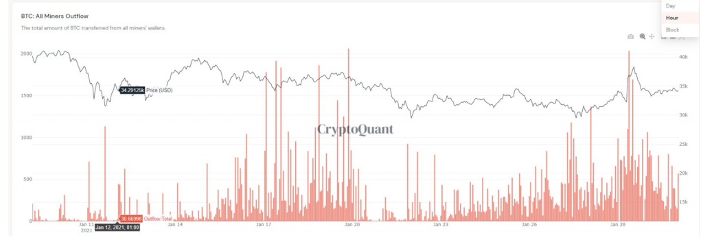
Miner outflows represent the number of coins that leave blockchain addresses held by a referenced miner. Looking specifically at Bitcoin, the nature of the PoW system means there is a constant source of sell-side pressure on the price of bitcoin. That’s because miners receive bitcoins—that is, block rewards—as compensation for securing the network, and then sell some or all of these bitcoins so they can cover their fiat-denominated expenses. Examples of miners’ expenses include mining equipment, electricity and labour.
Tracking miner outflows can help you gauge the extent to which miners are exerting sell-side pressure on bitcoin’s price. (This can also be done by tracking total miner balance.)
Exchange flows
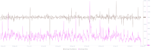
Exchange flows track the difference in the number of coins being sent to and from exchange-owned addresses. Positive values indicate that more coins have flowed into these addresses than out, and vice versa.
Exchange flows can help you gauge the level of sell- and buy-side pressure. For example, a spike in exchange inflows may indicate that holders are preparing to sell, which could place strong sell-side pressure on the market. By contrast, increasing exchange outflows signals that more holders are custodying their coins, perhaps because they are medium- or long-term bullish about its prospects. Do note that exchange flows tell you nothing about intention.
Net unrealised profit or loss (‘NUPL’)
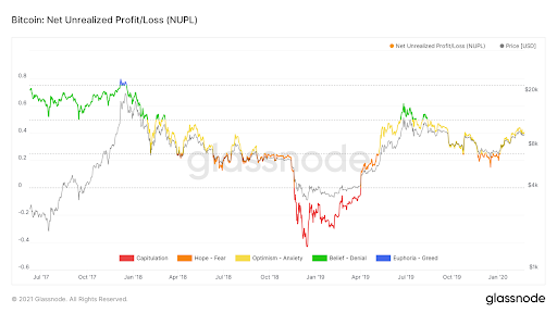
NUPL considers the difference between unrealised profit and loss to help you understand whether the network as a whole is at a profit or loss. (Unrealised profits or loss refers to the profit or loss that a holder would make if they sold their holdings at market price.)
Market value to realised value (‘MVRV’)
MVRV shows the average profit or loss of all BTC holders based on the price when each unit last moved.
Tracking NUPLV and MVRV is useful as, due to the volatile nature of cryptocurrency prices, there are long-term holders who buy cryptocurrencies and hold for a long time. This can mean a substantial amount of holders are sitting on significant unrealised profits.
For example, if holders of a cryptocurrency are in historic unrealised profits, this could indicate holders may soon take profits. Likewise, if cryptocurrency holders are sitting on historic losses, they may opt to hold rather than realise their losses by selling.
This is why using multiple on-chain metrics is so important. You might see increasing levels of unrealised profits for a cryptocurrency, and then by looking to exchange inflows you could also see a large spike, which may signal increased profit-taking.
MVRV can help inform whether a particular market is under- or over-valued. An MVRV of 0–1 may be interpreted as “undervalued” on average, as holders will be realising losses if they all sell their holdings. Generally speaking, MVRV increases in bull markets and decreases in bear markets.
Dormant coins
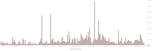
Glassnode and Santiment track dormant coin movements. This simply calculates the amount of previously idle coins which have moved during a specific period. Santiment tells us the total amount of idle coins which have moved, whereas Glassnode calculates the average coin dormancy—that is, the average number of days that each coin transacted on a given day remained dormant prior to moving.
High dormancy indicates that old coins are returning into circulation, whilst low dormancy means that coins being moved haven’t been held for a relatively short amount of time. This tells us useful information about potentially high amounts of coins that are starting to move, a common sign of profit-taking or indicating a rise in sell-side pressure. On the contrary, if there is a large decline in the number of old coins being moved this could indicate continued accumulation and an unwillingness for users to touch their cryptocurrency.
Important: Just like exchange flows, dormant coins reveal nothing about the reason why old coins have moved. There can be all sorts of reasons behind why old coins move. Some of these reasons aren’t necessarily bullish or bearish. For example, old coins may be transferred to a new address for security reasons, or they may be sent to a lending platform’s address to earn interest.
Examples of other on-chain metrics that were not included in this resource: market cap, realised cap, spent output profit ratio (‘SOPR’), unrealised profit, miner revenue, HODL waves, DeFi metrics, total value locked (‘TVL’), loans outstanding, volume and active addresses.
